ZIVA FARMS
logo / client project
INTRODUCTION
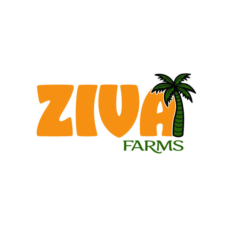
For this project, I designed a logo for Ziva Farms. The client requested that the words “Ziva” and “Farms” be included, while leaving the rest of the creative direction open. My aim was to create a logo that feels vibrant and welcoming, while also reflecting a sense of place and identity connected to Nigeria.
DESIGN DECISIONS
Logo: Curved edges and bold weight convey a lively, dynamic tone. Incorporated a palm tree to reflect Nigeria’s geography and add a touch of exotic character.
Color Palette: Chose a bright orange as the primary color for energy and visibility, contrasted with deep green for balance and stability.
Typography: While ‘Ziva’ is the focal point of the logo, ‘Farms’ is balancing out overall weight with similar rounded characters, but much more subtle weight on it.
DESIGN PROCESS
Since the business is based in Nigeria, I wanted to incorporate a palm tree to establish a geographical and cultural connection, while also adding an element of exotic appeal. I selected bright orange as the primary color to make the logo eye-catching and cheerful, and paired it with deep green for contrast and balance.
For the typography, I chose a rounded, bold font for “Ziva,” as this was the key focus for the client and needed to stand out. I selected this style because its cheerful, rounded forms pair well with the vibrant orange, together creating the energetic and approachable vibe I was aiming for. I explored how the palm tree could interact with the text, ensuring the letters remained clear and readable while the palm added character. For “Farms,” I used a complementary font that supports the main typeface and gives the logo an approachable, friendly feel.
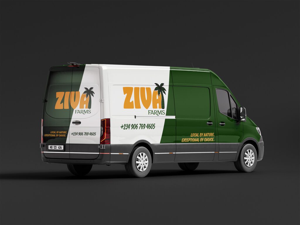
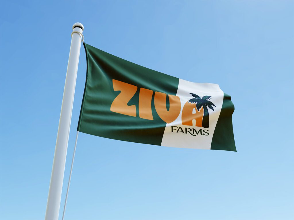
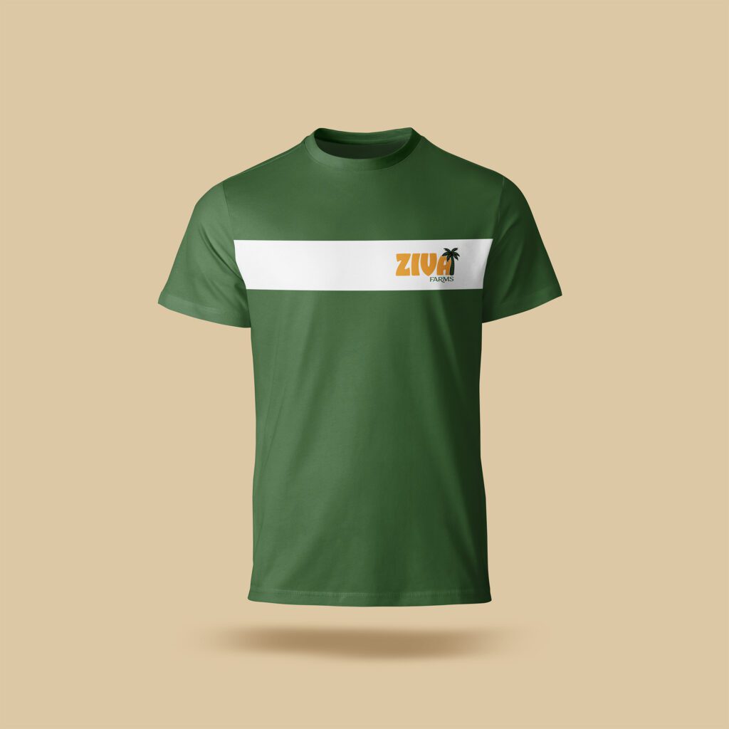
MOCKUPS