TROPICOOL
logo / course assignment
INTRODUCTION
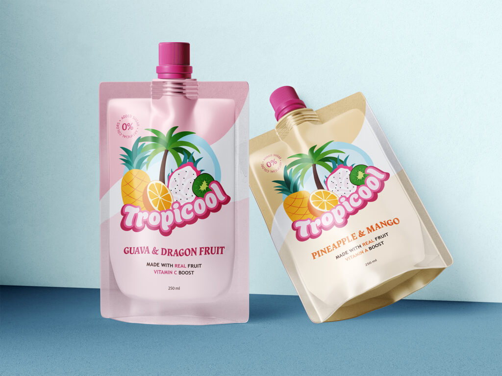
For this project, I designed a logo for Tropicool, a soft drinks company specializing in tropical juice pouches. The client wanted a logo that feels upbeat, attractive, and very colorful, appealing to a target audience of 5–40 year olds. Their brief emphasized that the logo should appear cool, refreshing, fresh, and tropical, with cartoon-like fruits and playful elements that highlight the fun and vibrant nature of the brand.
DESIGN DECISIONS
Logo: I hand-illustrated exotic fruits and a palm tree, giving the logo a playful and tropical theme. The typography is thick, flowing, and framed, making the text stand out from a distance while maintaining a recognizable and consistent style.
Color Palette: I used bright, energetic colors inspired by tropical fruits to make the logo visually engaging and appealing. The colors reflect the freshness and vibrancy of the juices, while helping each element pop in the composition.
Composition: The logo includes a blue shape in the background, evoking the sky to reinforce a tropical and fresh atmosphere. I designed the text with a bold frame to integrate it with the illustrations, ensuring the logo remains cohesive, balanced, and versatile for both print and digital applications.
DESIGN PROCESS
The project began by exploring different tropical themes and visual styles to create a logo that captures the essence of Tropicool. I hand-illustrated exotic fruits and a palm tree, experimenting with placement, color combinations, and the blue background element to achieve a fun and refreshing look. The typography was developed to be thick, flowing, and framed, ensuring it is highly legible and visually integrated with the illustrations. The final logo is a vibrant and cohesive design that communicates the brand’s playful, tropical identity.
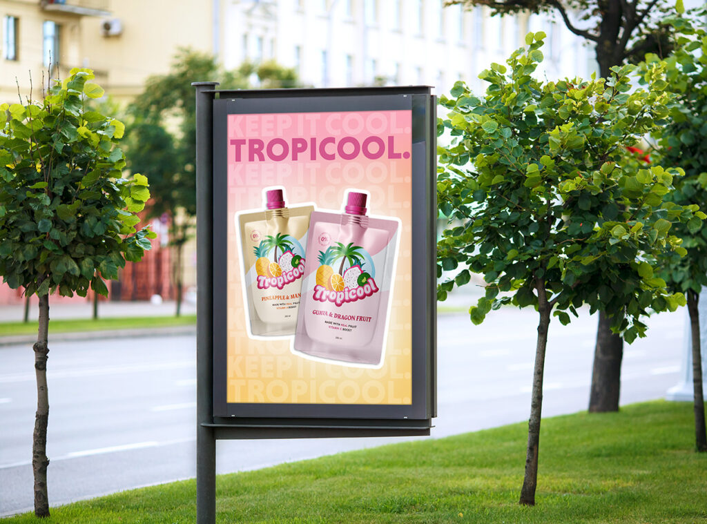
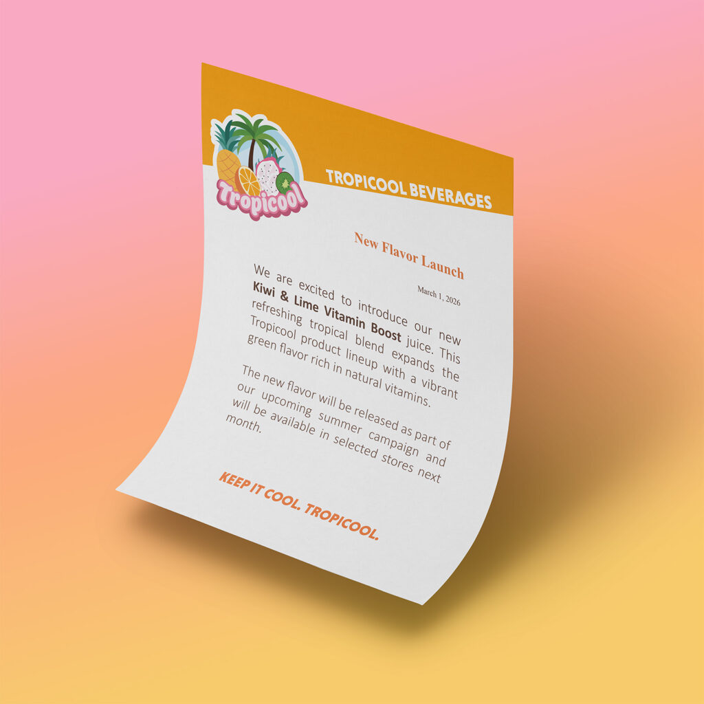
MOCKUPS