SMART PANTRY
magazine design / personal project

INTRODUCTION
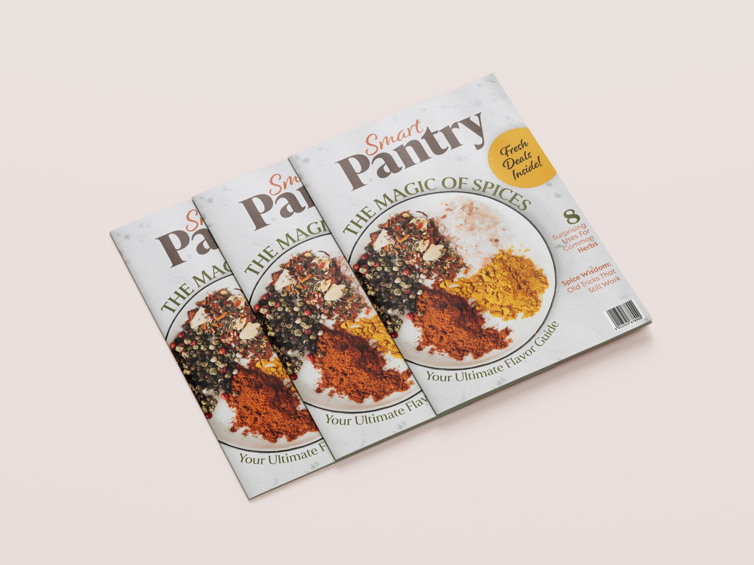
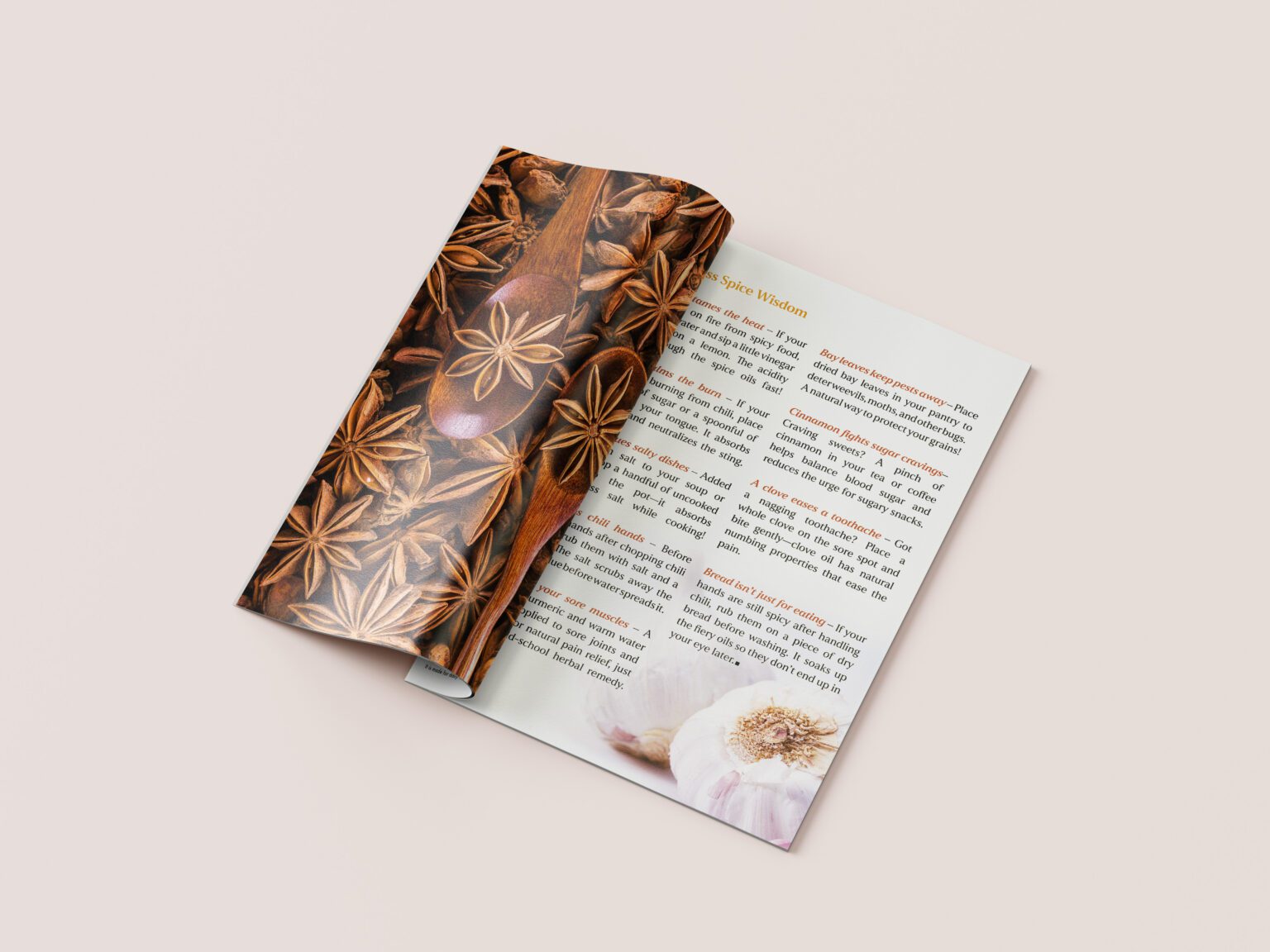
Smart Pantry is a personal project created to strengthen my Adobe InDesign skills and explore magazine design. The concept was aimed at people who appreciate homemade goods such as preserves and juices, while also enjoying useful deals and tips. The main feature article focused on spices, with the goal of inspiring readers through vibrant visuals and practical content.
DESIGN DECISIONS
Typography: Pairing ‘Smart’ in a smaller, casual handwritten style to feel approachable, and ‘Pantry’ in bold lettering to ensure easy recognition and strong shelf presence.
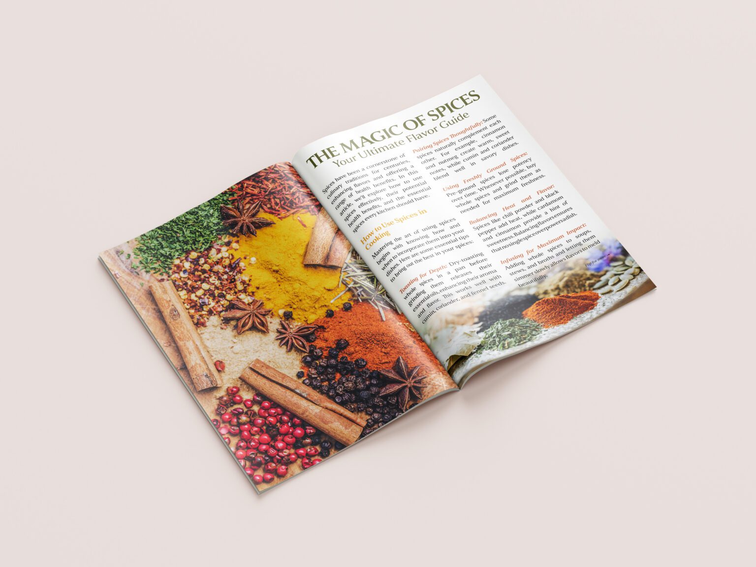
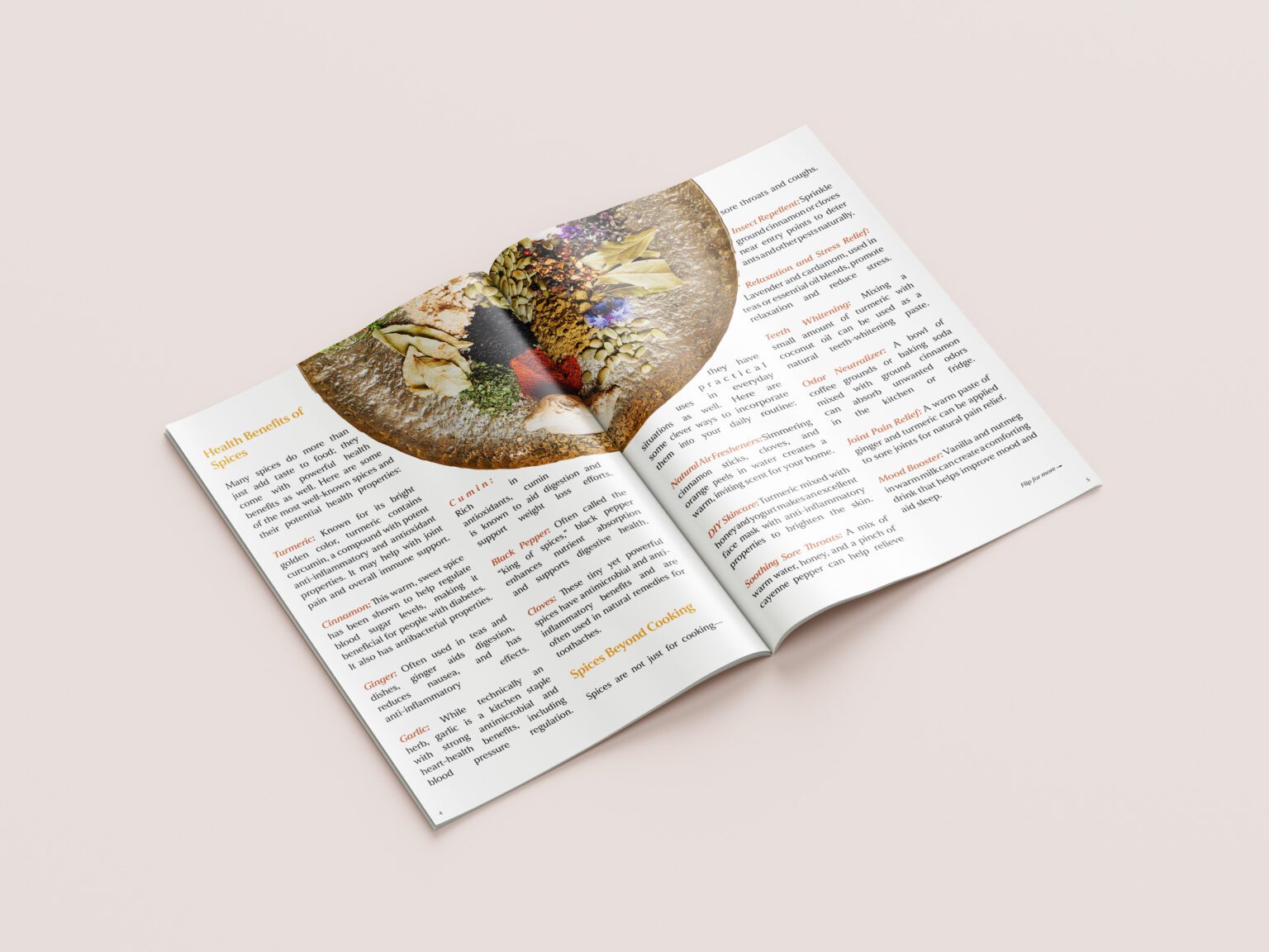
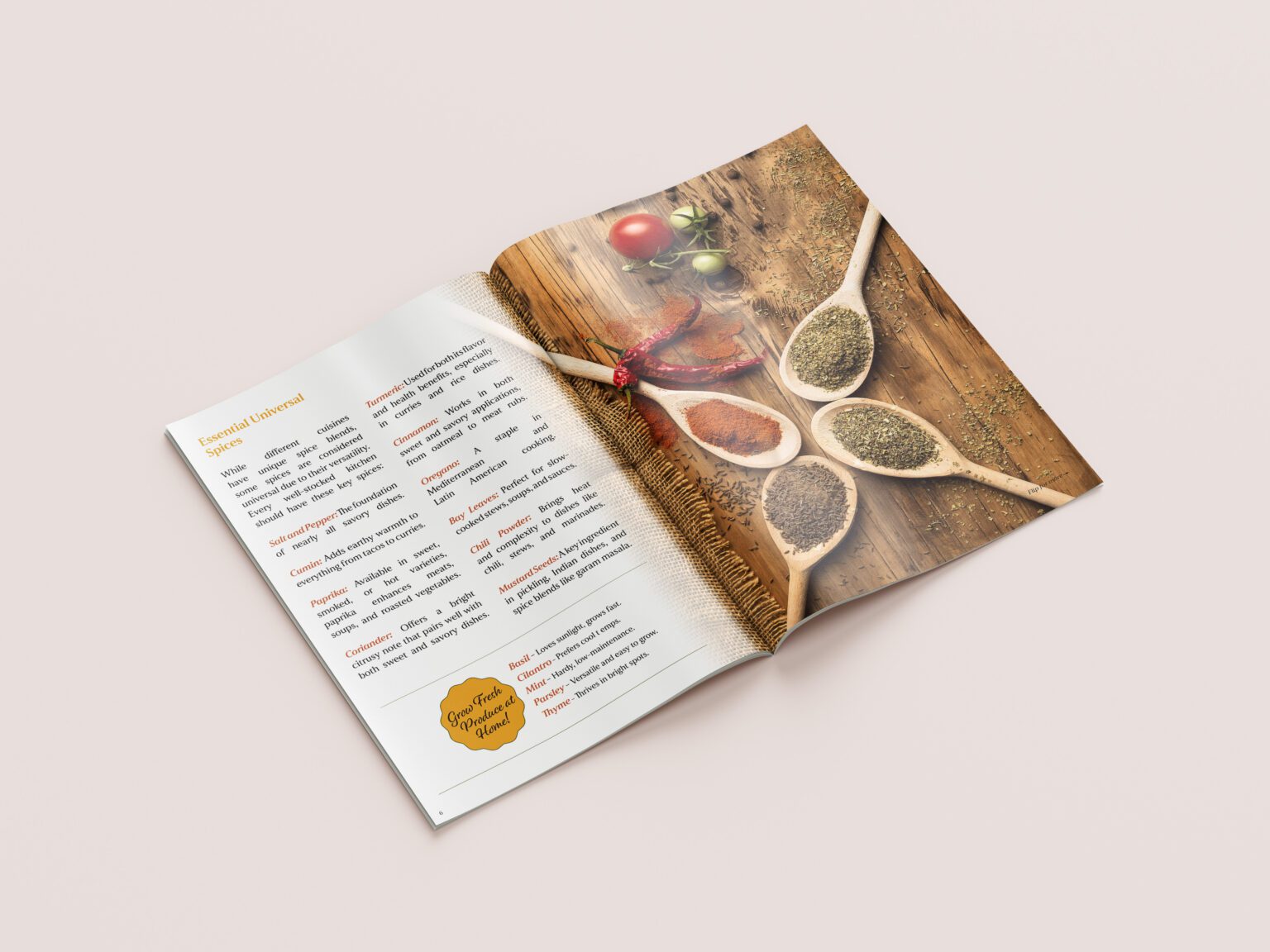
Imagery: Choosing vibrant, high-quality photos that highlight spices and homemade goods but also evoke a sense of comfort and warmth.
Layout: Designing with readability in mind, using spacious layouts and thoughtful image placement to guide the reader through the content.
Audience focus: Targeting readers who value quality, affordability, and homemade traditions, ensuring the magazine reflects both inspiration and practicality.
DESIGN PROCESS
I began by outlining the theme and researching visual references that would capture both warmth and freshness. To achieve this, I sourced high-quality photos from free stock libraries, selecting images with bright colors to catch the reader’s attention. At the same time, I looked for compositions that conveyed a cozy, homely feeling, supporting the magazine’s focus on homemade products. Using Adobe InDesign, I worked on layout, balancing images with text in a way that feels inviting and easy to navigate.
MOCKUPS