MM KORISTUSABI
logo / client project
INTRODUCTION
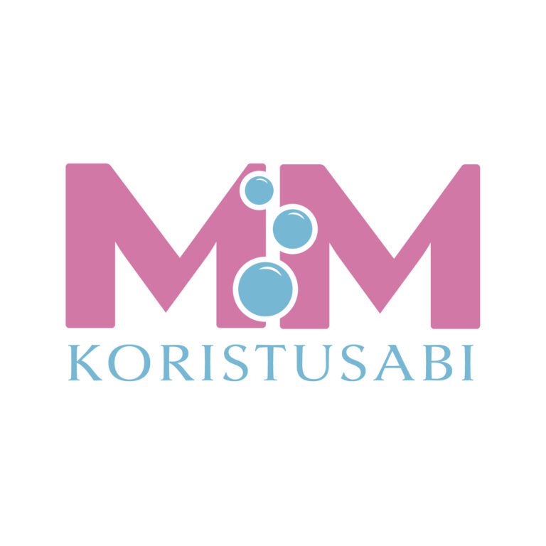
For this project, I designed a logo for MM Koristuabi. The client wanted the initials “M” and “M” to be featured, along with the word Koristuabi, reflecting the nature of the service. My goal was to create a logo that feels approachable and friendly, while remaining professional and memorable – conveying cleanliness and care, and highlighting the company’s unique identity.
DESIGN DECISIONS
Logo: Outstanding initials of MM with bubbles between the letters to suggest cleanliness, freshness, and inject personality into the logo.
Color Palette: Using bright pink as the primary color to reflect the feminine identity, with blue accents to make the logo more eye-catching.
DESIGN PROCESS
The client provided the initials and overall concept but gave me creative freedom in how to present the logo. I explored different color combinations, ultimately choosing bright pink as the primary color to emphasize the feminine identity of the business, complemented by blue for contrast and visual impact. To add personality and a dynamic touch, I experimented with incorporating bubbles between the letters, testing placement and size until the composition felt balanced and visually engaging.
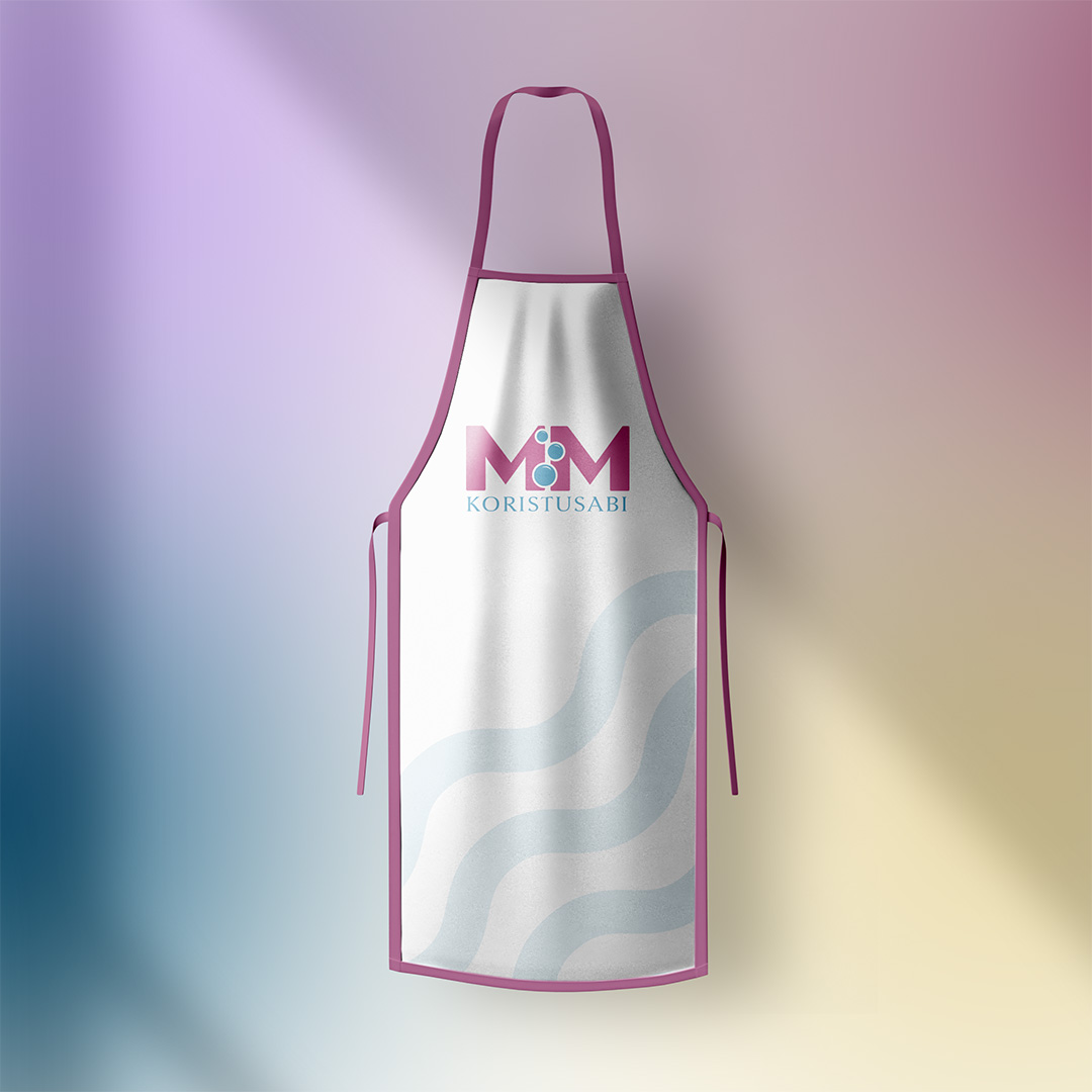
MOCKUPS