CHEEKI SKINCARE
packaging & social media / personal project
INTRODUCTION
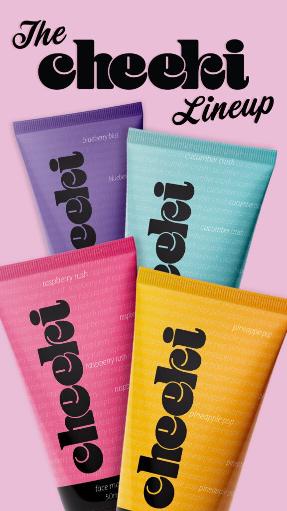
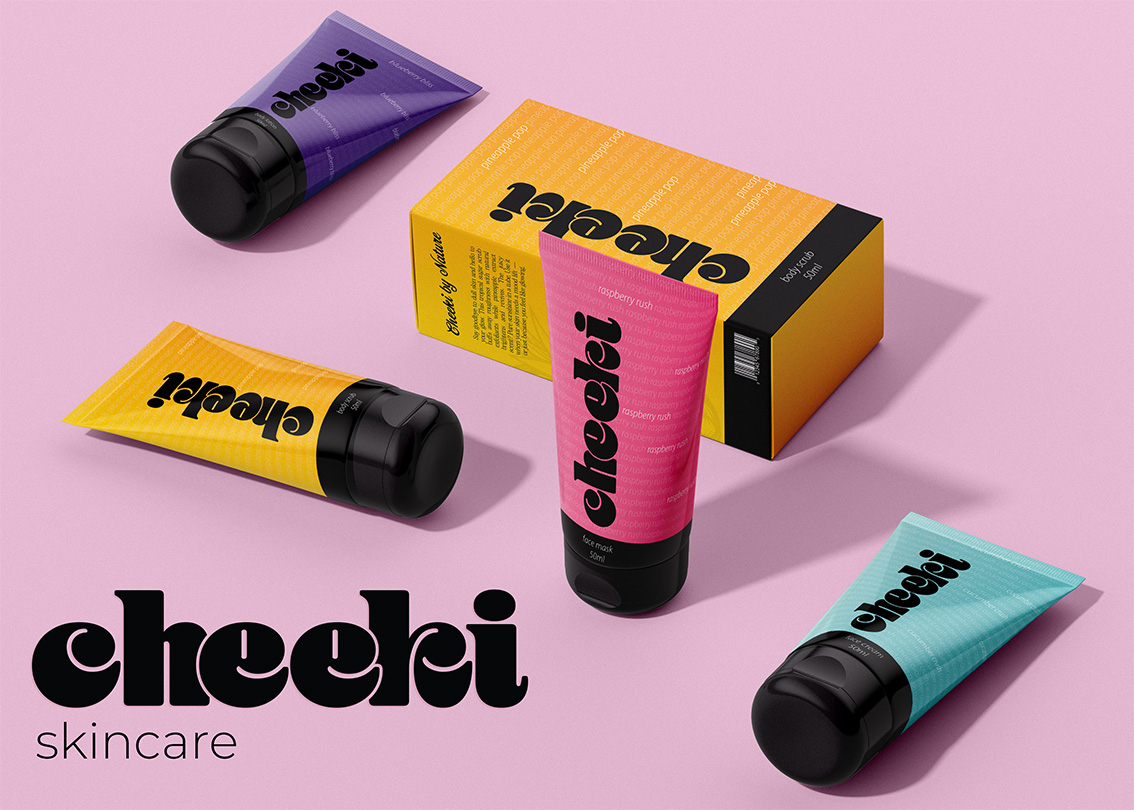
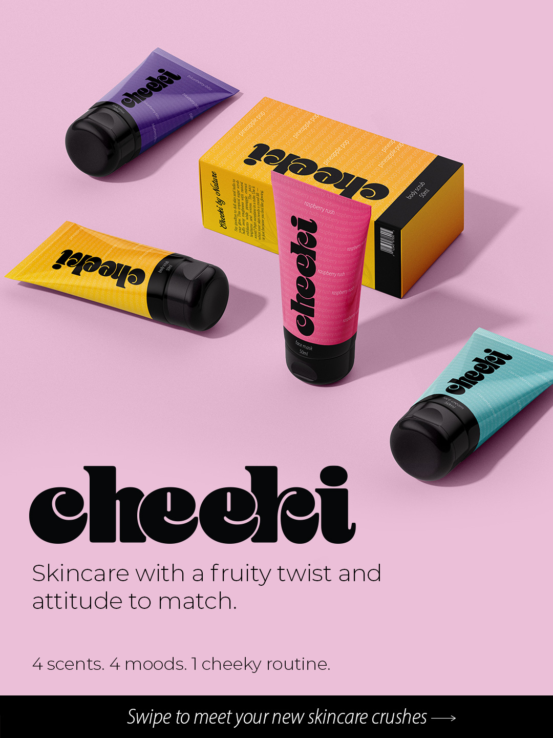
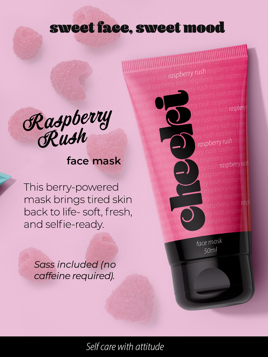
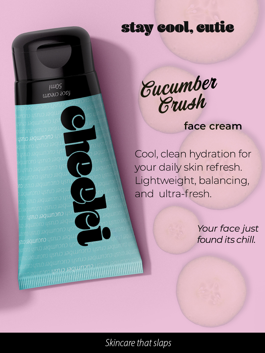
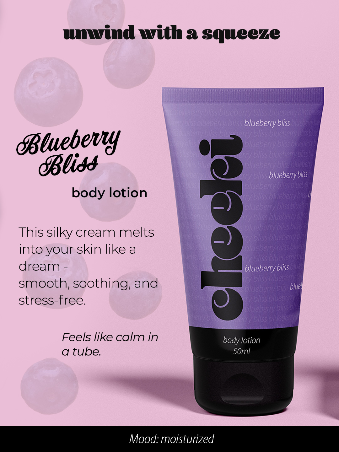
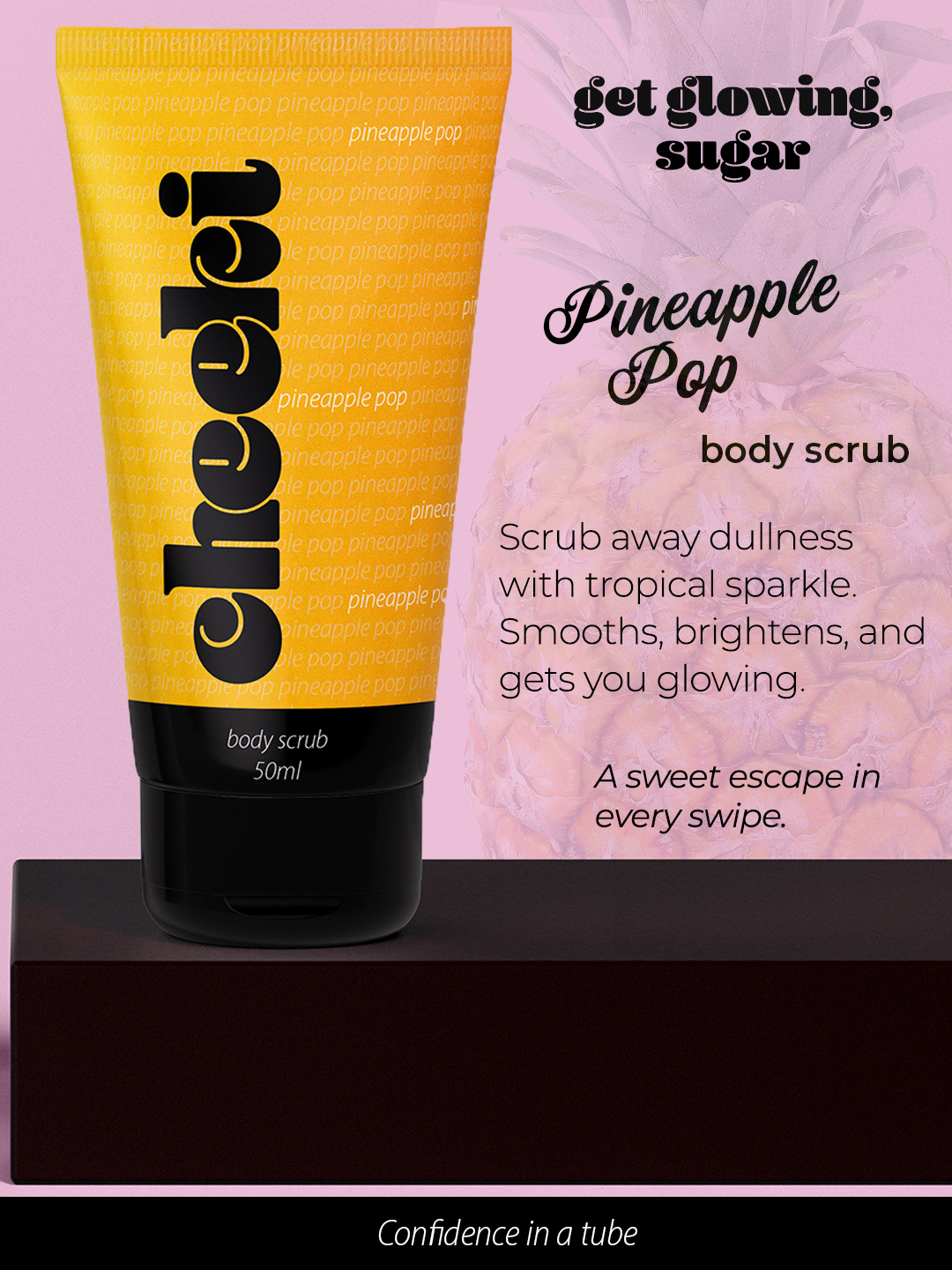
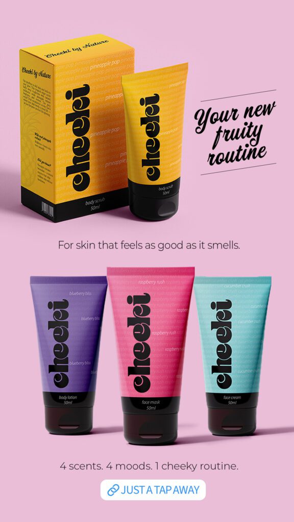
Cheeki is a vibrant, playful, and youthful body care brand designed to bring fun, color, and a little cheekiness into everyday skincare routines. The brand focuses on delivering bold, bright products with juicy, inviting scents that make skincare feel like a mood-boosting ritual. Cheeki’s target audience is young adults and skincare enthusiasts who value both effective formulas and expressive packaging with personality.
This was a self-initiated packaging design project where my goal was to create a bold and cohesive visual identity that communicates Cheeki’s lively personality. From logo design to packaging layouts and typography choices, every element was crafted to reflect the brand’s cheeky, feel-good essence.
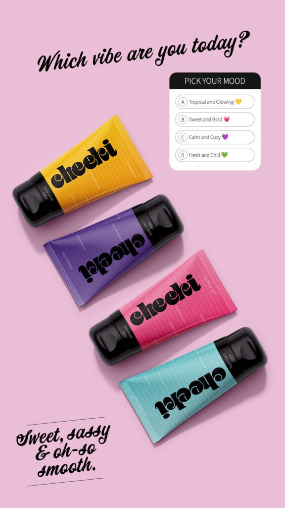
DESIGN DECISIONS
Logo: Rounded bold logo for youthful tone, black color for a touch of sophistication.
Color palette: Fruit-inspired colors to match scents and moods.
Imagery: Avoided literal fruit images to keep the design clean.
Typography: Traditional sans-serif font to balance out the boldness of the logo.
DESIGN PROCESS
The process started with a clear visual idea in my mind: bright, colorful tubes that instantly grab attention. I created the logo to be bold and full of personality – something that could stand confidently on its own as the packaging’s focal point. I explored various typefaces to find the right balance between playful and unique.
I opted to leave out images or illustrations of fruit that would match with the fruity scents of each product to avoid an overwhelming design result. Instead I focused on the bright colors paired with the bold logo, and added texture and depth by using the product name repeatedly across the tube.
While gathering visual inspiration online, I paid close attention to how vibrant color could be used without feeling childish. The goal was to create a look that’s fun and expressive, yet polished enough to appeal to young adults. Throughout the process, I kept refining the balance between boldness, clarity, and a touch of sophistication.
Instagram Carousel
Instagram Stories
Instagram REEL COVER