BESPOKE MOUNTAIN BIKES
brand identity / personal project
INTRODUCTION
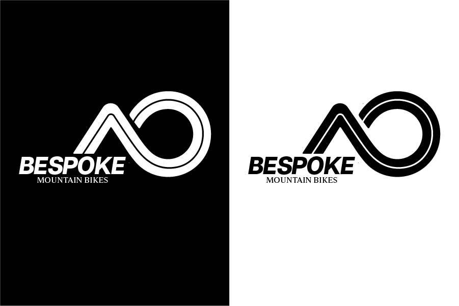
Bespoke Mountain Bikes is a bicycle shop specializing in custom-made mountain bikes for adventurous outdoor lovers. The name “Bespoke” plays on the idea of customization and the central spokes of a bike wheel. Their audience includes trail riders and hikers who value boldness, performance, and individuality. The logo needed to be modern, readable at small sizes for online use, and versatile enough to be printed on bikes, apparel, and gear.
This logo design was created as part of a graphic design course project, where I applied branding principles to develop a strong and adaptable visual identity for the brand.
DESIGN DECISIONS
- Logo: Brought an interpretation of a mountain and a wheel into the logo.
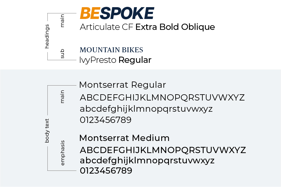
- Typography: Modern fonts for maintining readabilty when scaling.
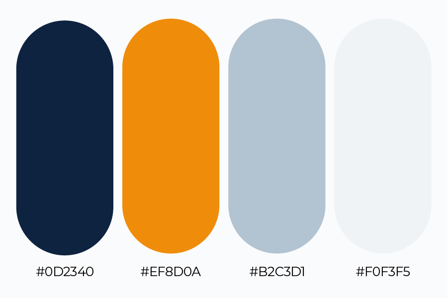
- Color palette: Neutral, but outstanding with energetic-feeling accent.
- Versatility: Designed the logo to be adaptable for bikes, apparel, and accessories.
DESIGN PROCESS
The client provided visual references that guided the direction of the logo. I aimed to create a minimalist logo mark that felt strong and adventurous, much like the brand itself. I explored different color options, focusing on bold, high-contrast tones that convey energy and confidence. I aimed to incorporate shapes of a mountain and a wheel into the logo, to make it quite literal but at the same time not too obvious. I intended the logo to have hidden meanings for more versatile use, and to possibly attract more people to it once they get to know the story behind the logo and the brand. The color palette was intended to be neutral while maintaining the strong, adventurous feel to it.
LOGO
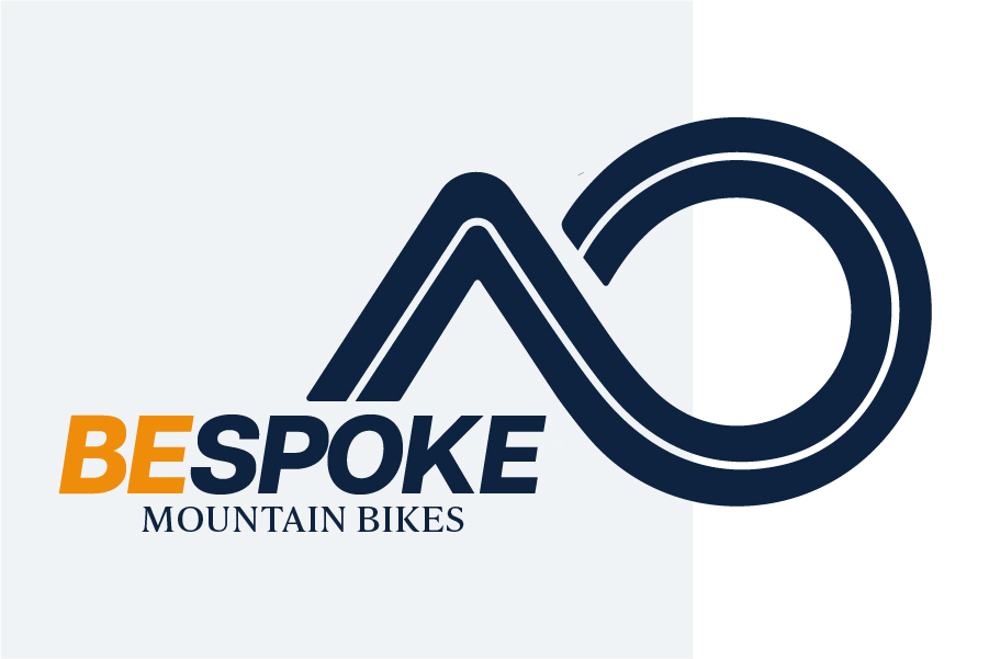
The logo was designed to be modern and simple, reflecting the adventurous spirit of Bespoke Mountain Bikes. The triangle represents a mountain, and the circle a wheel – key elements of mountain biking.
A line runs through the center, resembling a road’s center line, symbolizing direction and forward motion. When rotated, the icon also forms a subtle B for Bespoke.
The letters BE are highlighted in orange to inspire riders to BE bold, BE adventurous, and BE unstoppable etc.
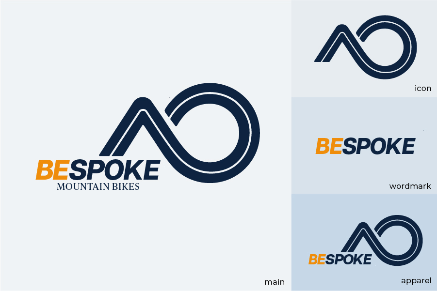
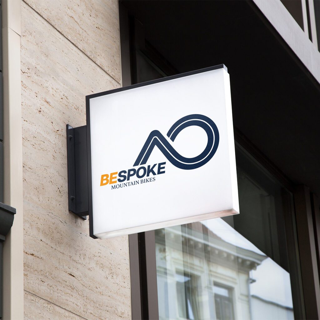
The main logo is used broadly for consistent brand recognition.
The compact icon works well for small spaces like app icons or digital badges.
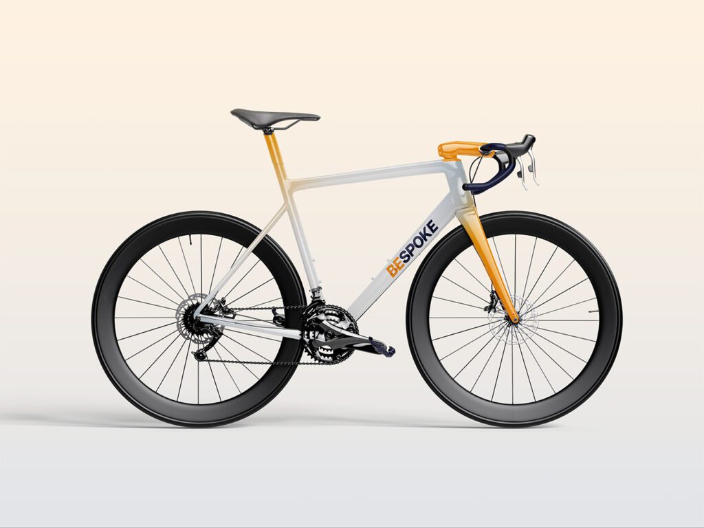
The wordmark featuring only “Bespoke” is intended for bike frames, where space is limited and a clean, straightforward look is preferred.
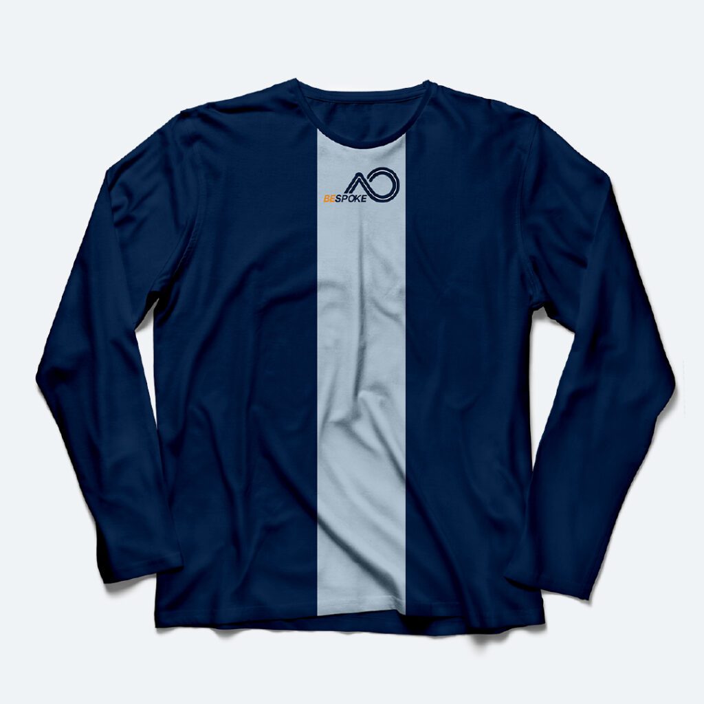
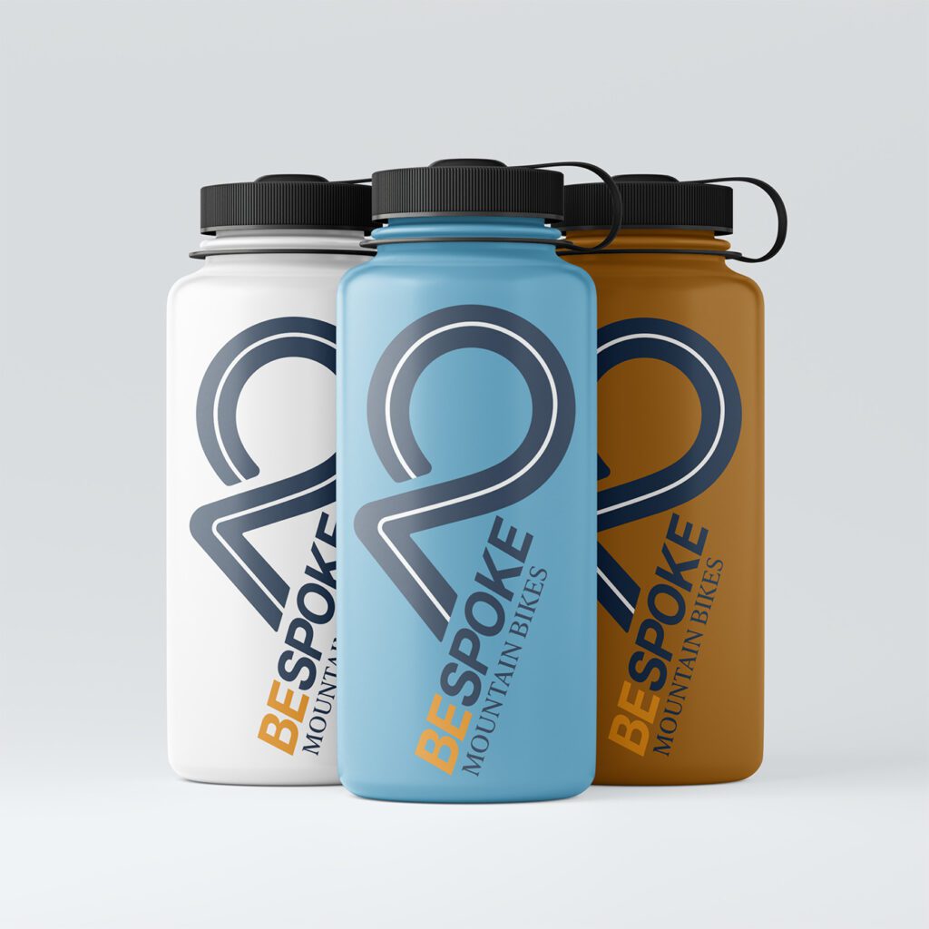
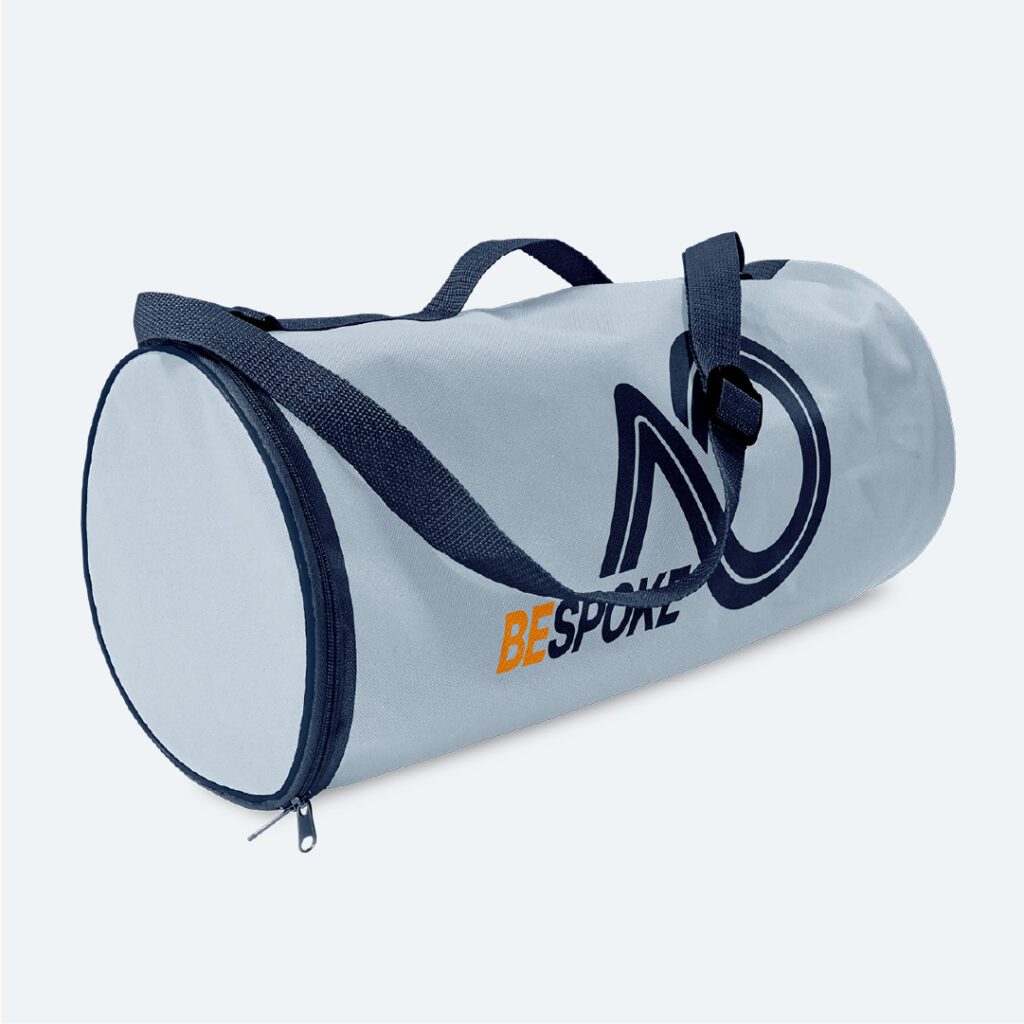
A variation with “Bespoke” plus icon (without “Mountain Bikes”) is for apparel and accessories. Other merchandise use the full logo for maximum visibility.
COLOR PALETTE & TYPOGRAPHY
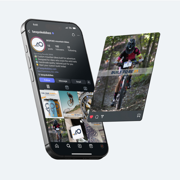
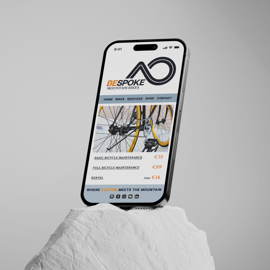
MOCKUPS